Challenge / Question
What needed to be solved.
The challenge was to create a distinctive, credible identity that communicates perspective and balance without relying on literal film clichés, while still working across screen and print.
Graphic Design / Project
A visual identity for an independent documentary production company, built around the letter S, exploring perspective, continuity, and the framing of stories.
Project Story
A visual identity for an independent documentary production company, built around the letter S, exploring perspective, continuity, and the framing of stories.
Concept
Sadeq equals truthful. Saba equals morning. The identity began with the letter S, shared by Sadeq and Saba. The form explores two opposing shapes held within a single structure, a visual idea of perspective, balance, and continuity that reflects the nature of documentary storytelling.
Challenge / Question
The challenge was to create a distinctive, credible identity that communicates perspective and balance without relying on literal film clichés, while still working across screen and print.
Approach & Process
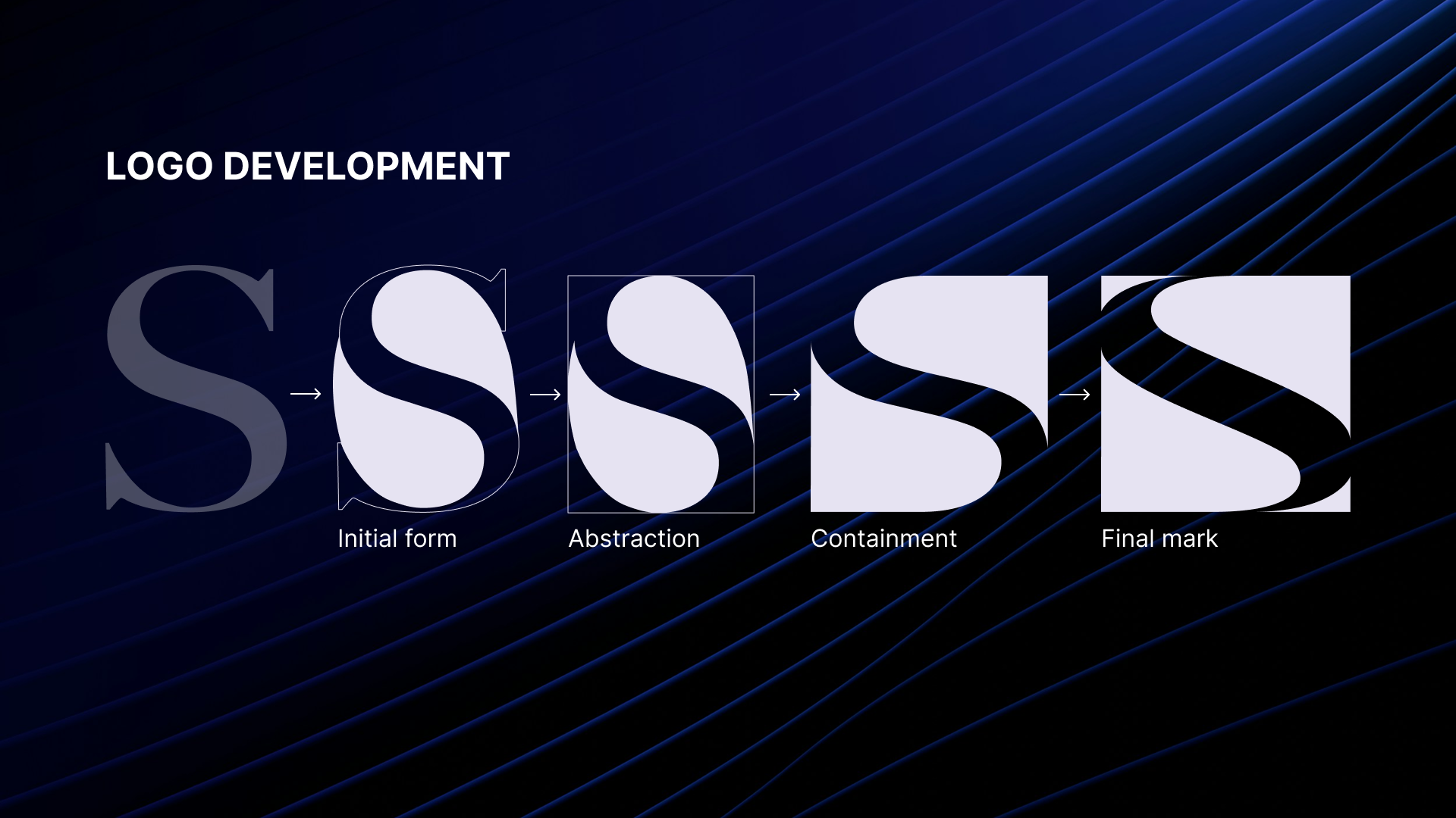
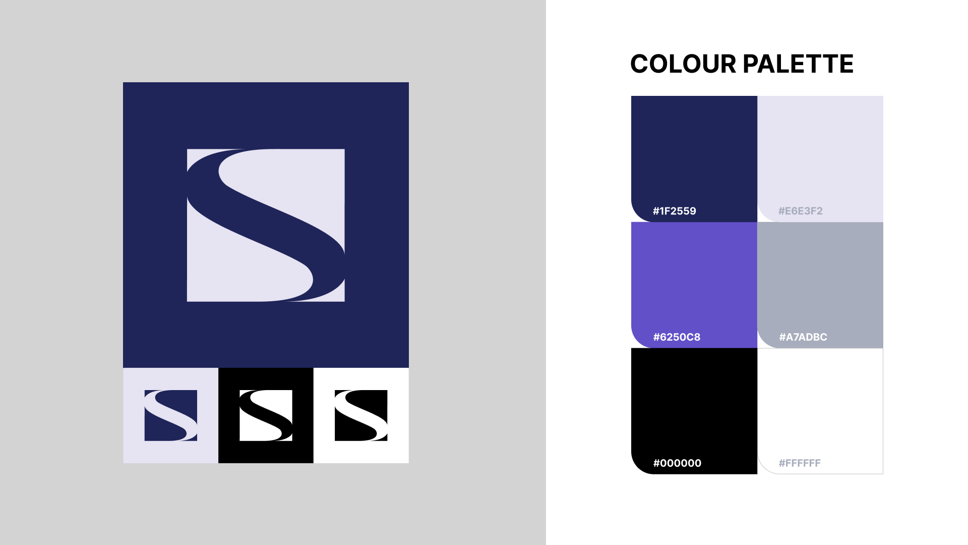
The process began with the S as two interacting forms, sketching and testing how positive and negative space could define the mark. I explored more literal film references early on, including film perforations, but those felt too descriptive. So, the mark was progressively simplified, balanced, and contained within a square, allowing the negative space to become the defining element.
Outcome
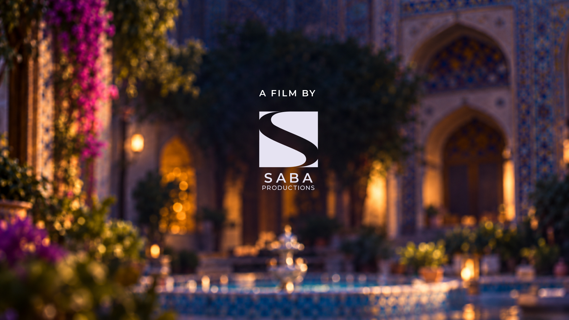
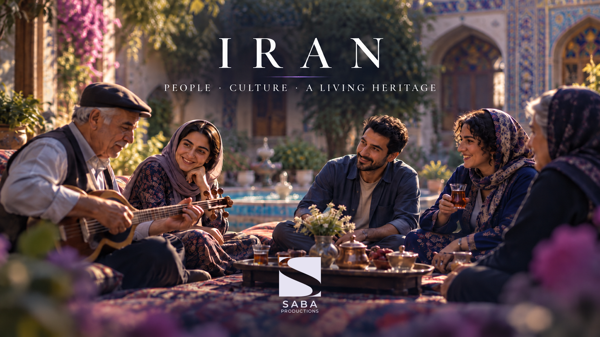
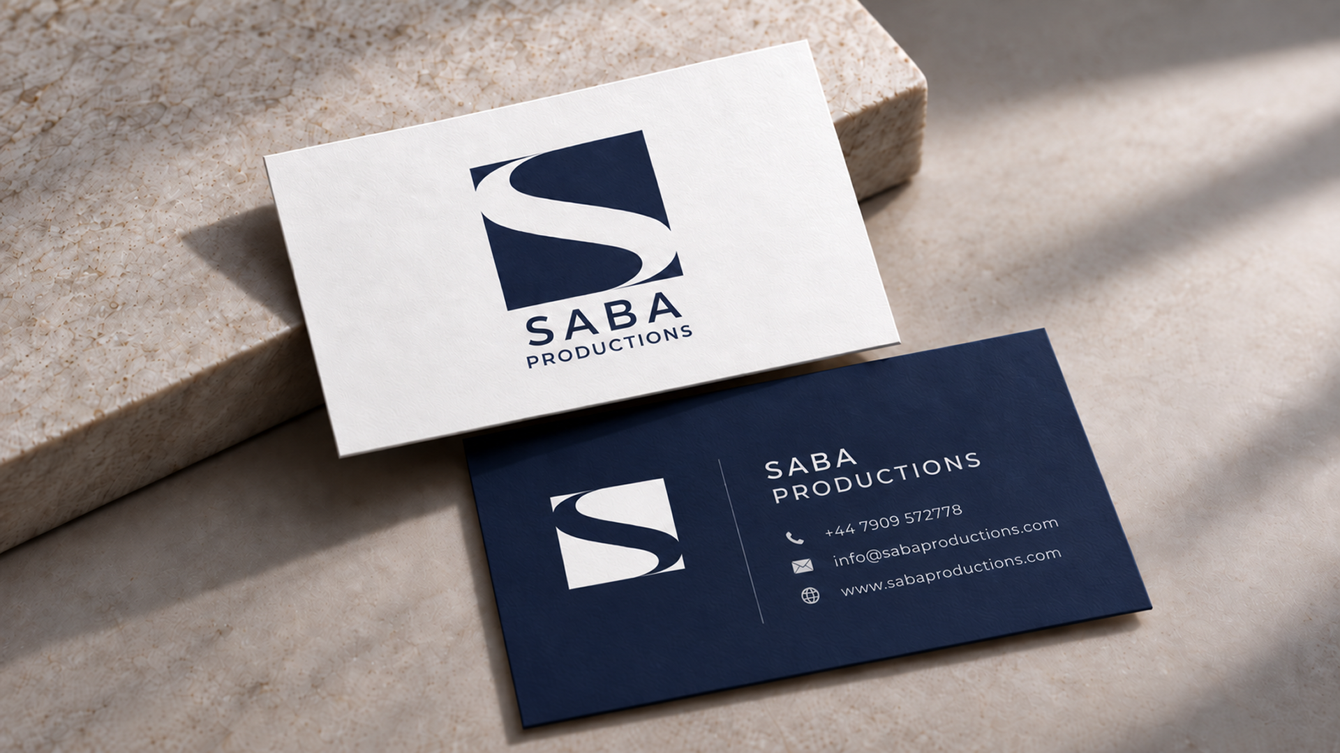
A restrained square S mark and flexible visual system that work confidently across screen and print. The outcome feels contemporary and distinctive without relying on literal film imagery.